the company «kikaku shitsu» is offering highly specialised planning expertise, mainly in the fields of public relations and communication, arts and culture, urban development and big scale events.
The word «企» in planning is an agreed character combining the hieroglyphs of «a person looking from the side» and «a foot standing still», which means «a person straightening his legs and looking far ahead». shinichiro moriya has always worked from the perspective of a «planner», and in doing so he has always been conscious of the need to keep his feet firmly on the ground (based on objective facts and realistic conditions) and to look far into the distance (imagining and verbalising a future that is not yet visible but is desirable).
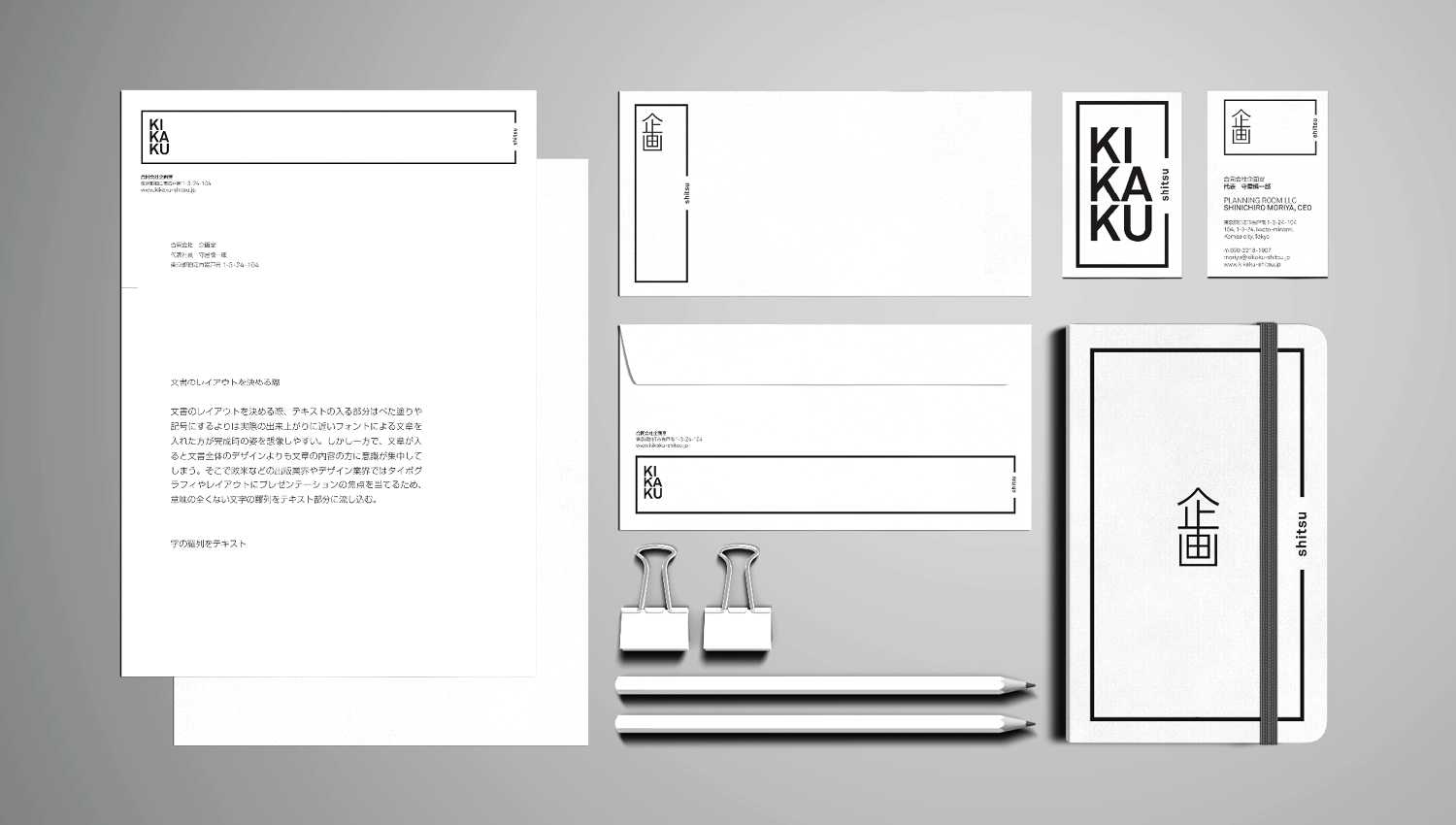
«kikaku shitsu» translates «planning room» in english. the logo is build up in square shape representing the «room», with an open space on the right side. the shape of the square is adjustable to the format. this flexible structure represents the companies ability to adjust to all kinds of tasks.
kikaku-shitsu