book design–––production
communicating: a guide to pr in japan
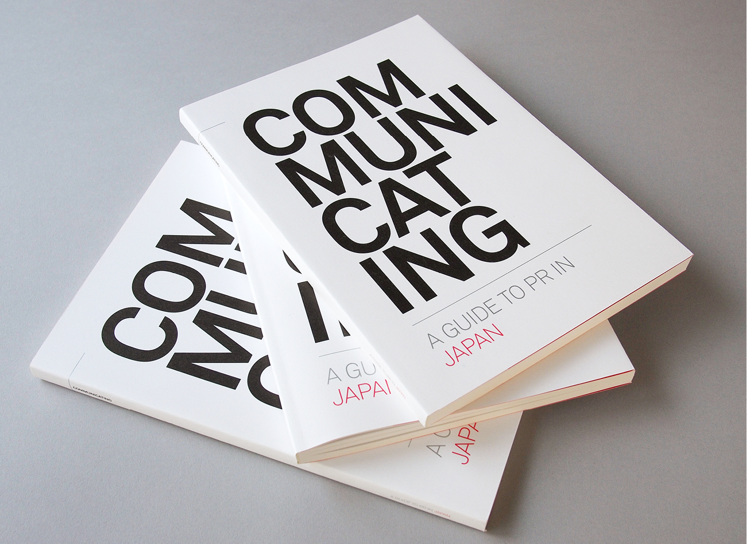
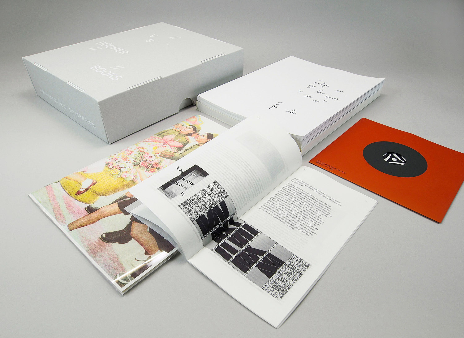
for foreign companies entering a new market it is very important to understand the customs and social norms in order to be successful. especially true in japan, this has led to one of the oldest agencies, dentsu public relations, to publish a guide to pr in Japan targeting pr managers of their global clients.
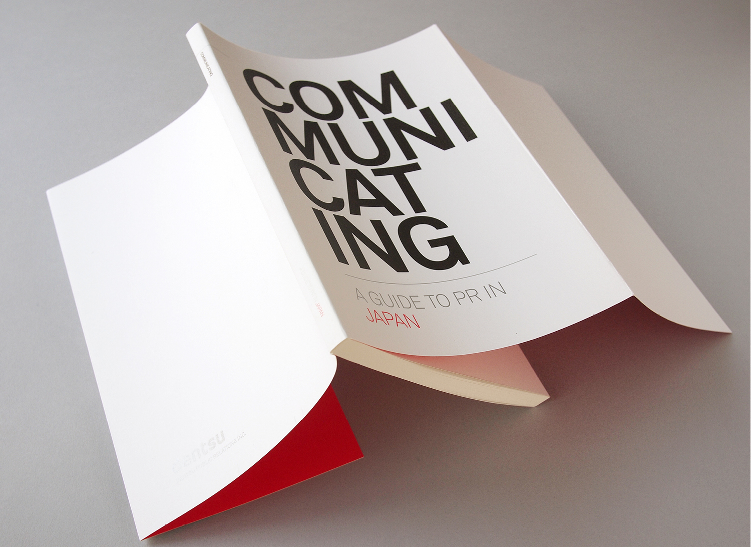
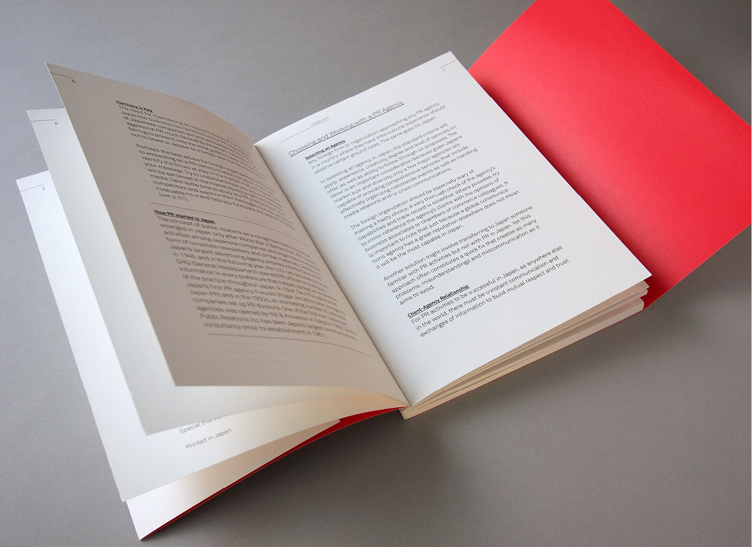
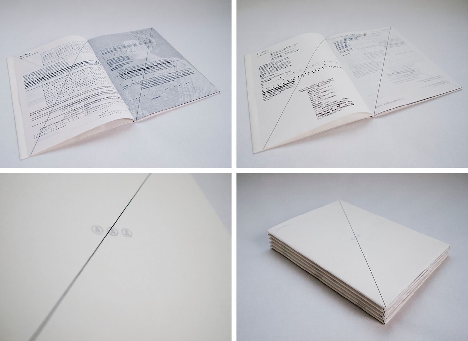
the big bold typography on the cover dividing the word COM-MUNI-CAT-ING unusually into four reflects the content by implying a different approach to communications. the use of matt and uncoated paper stock, sans serif font and white space with limited use of red and silver accents, conveys a japanese design aesthetic – both visually and to the touch. a simple layout makes it easy to read. keeping the font variations and sizes to a minimum, using equal word spacing and simplifying the graphic elements, enables the hierarchy of the content to be clearly visible and a large amount of information easily accessible.
com muni cat ing