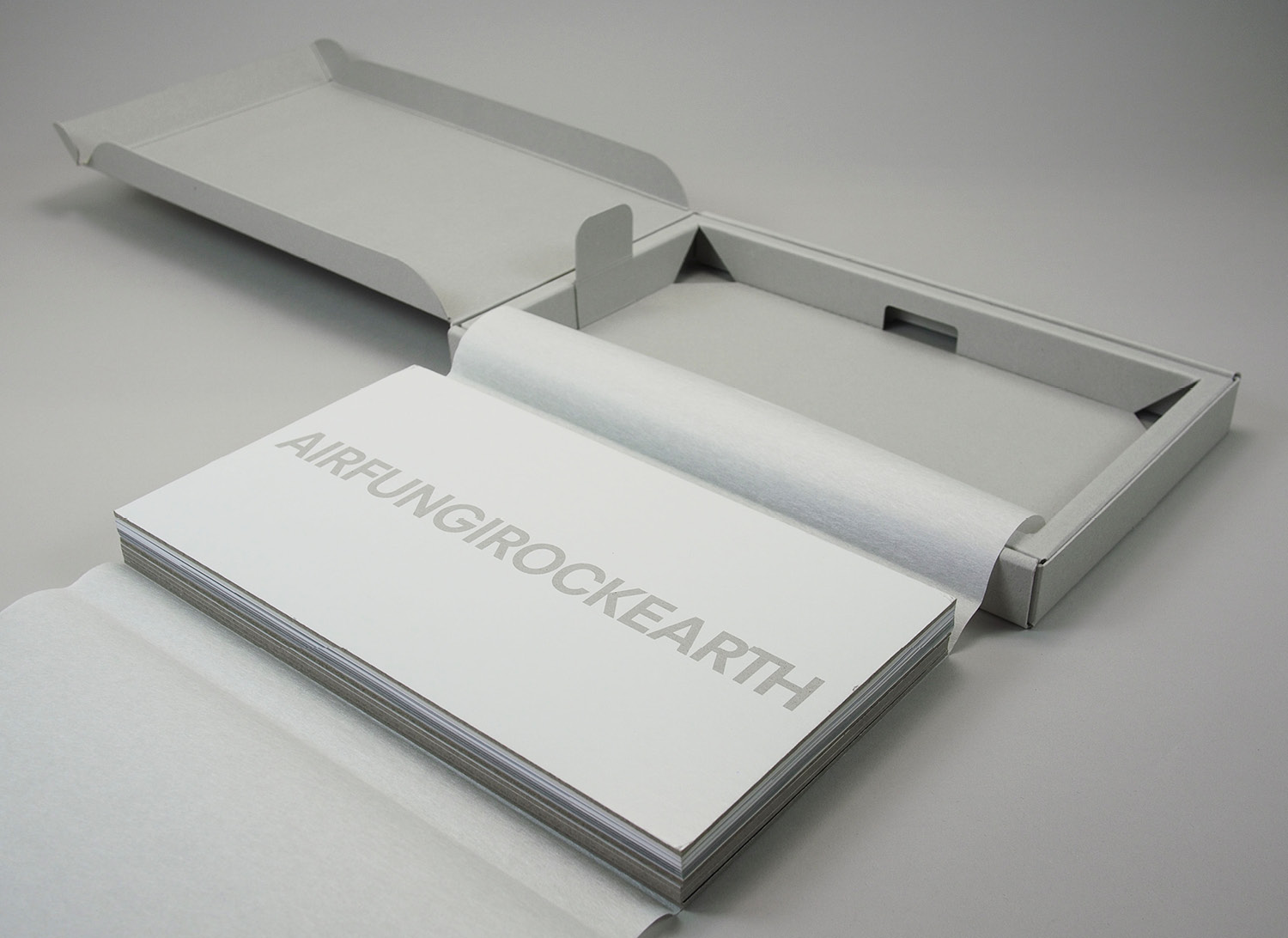
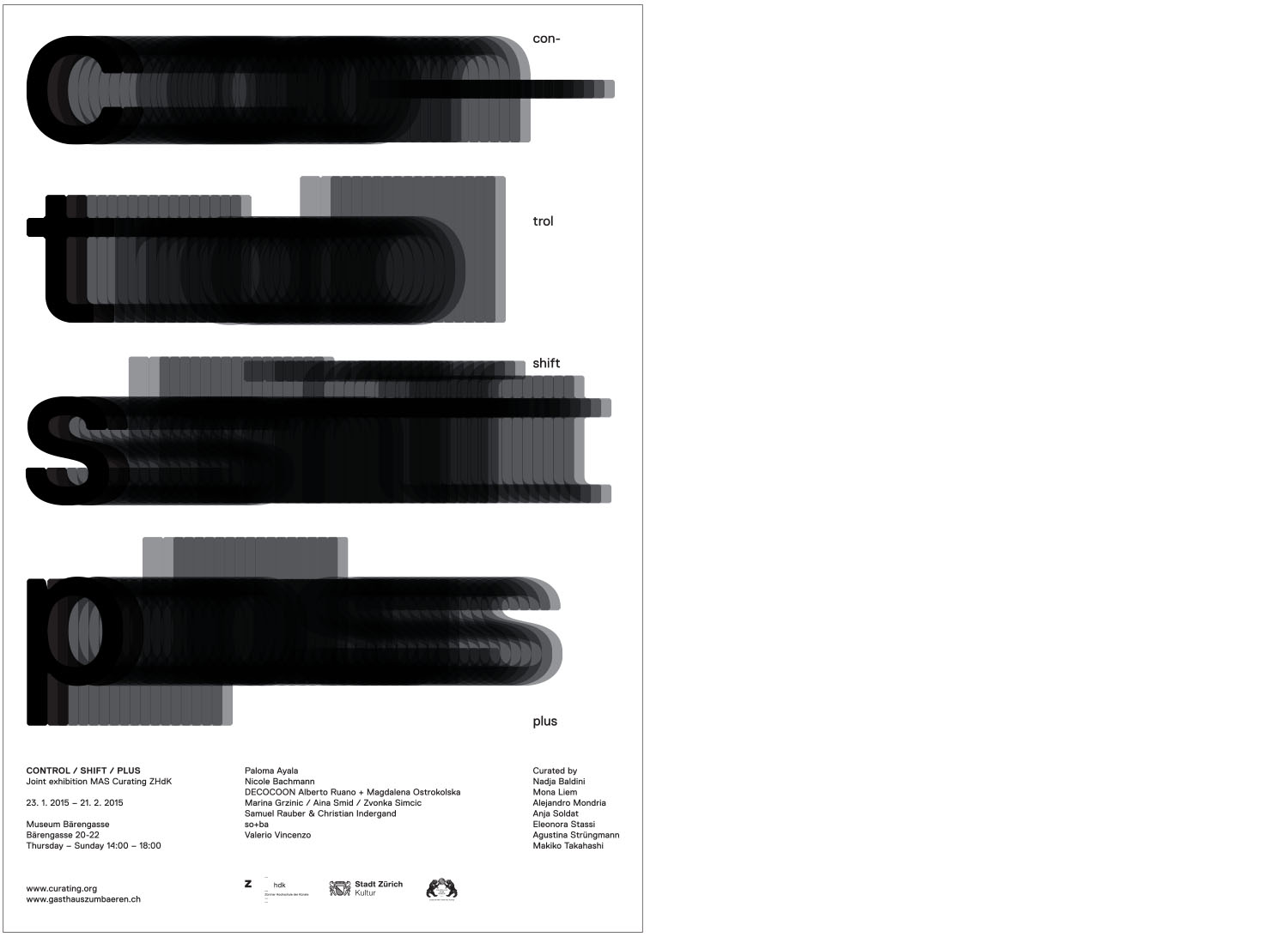
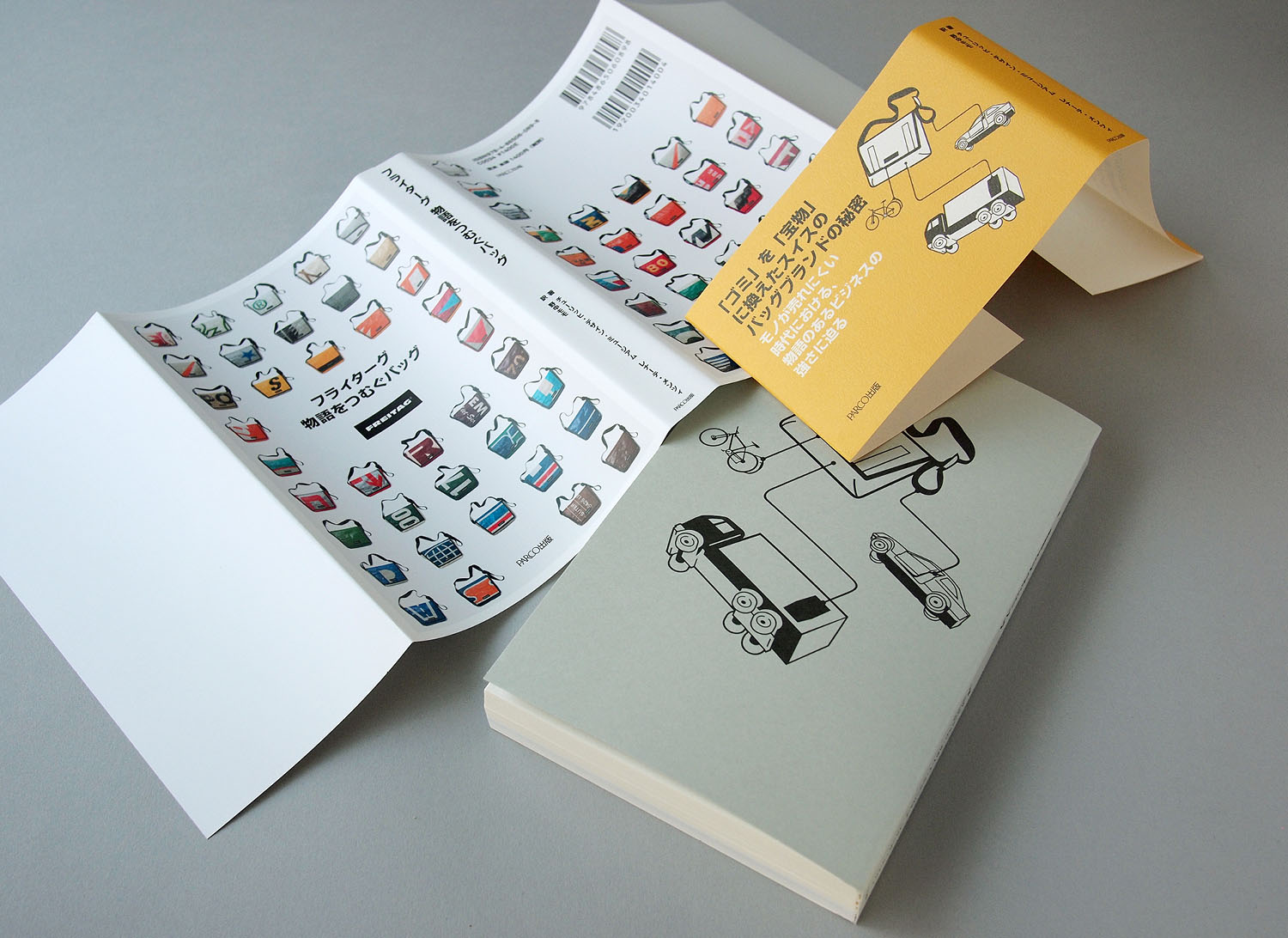
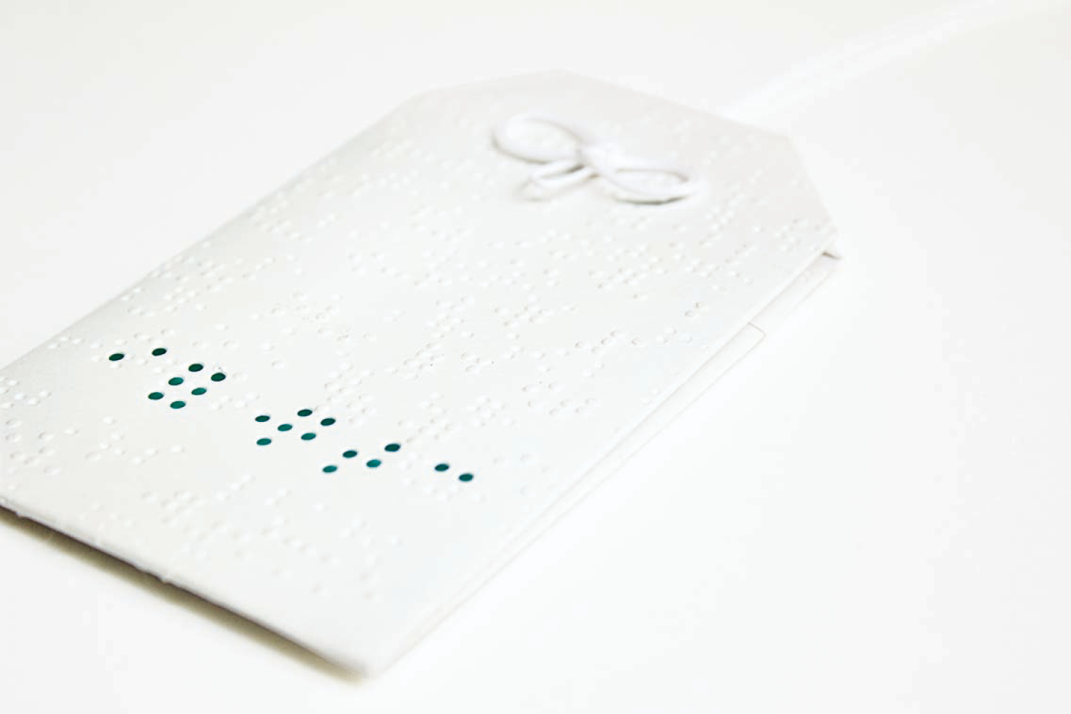
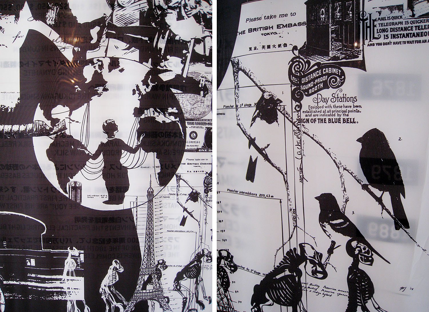
book and box design for onesal’s award-winning short film visualASMR visual ASMR (visual autonomous sensory meridian response) is the subjective experience of euphoria characterized by a combination of positive feelings and a distinct static-like tingling sensation on the skin. the use of different materials for the book, matt, glossy and natural paper, rough cardboard for […]
All posts filed under ‘typography’
27.7.–19.12.2023——–––––zagakuzagaku is a format where artists and researchers at the forefront of their fields are invited to share their professionally honed sensibilities, aesthetics, and ways of thinking in a dialogue format with ando yoko. the design visualises the japanese word zagaku (座学 (ざがく), conversation and dialogue with typography. the invited guests are: tsutomu okada, rakufu […]
DESHITABI—————LOGO AND WEBSITE
deshitabi is a new style of travel. a modern take on the traditional apprentice-master dynamic, it’s a unique experience that offers the rare opportunity to learn, at first hand, from Japan’s finest craftsmanship masters who share generations-old techniques and methods—all with a modern twist.deshitabi.jp
CONNECTING DOTS IN TSURUMI—————weTREES
creating, collecting and connecting dots in tsurumiMAKE THE CITY TALK dots (circles) represent the notions of unity, integration, wholeness, they give us a sense of completion, confidence, and harmony. they have no beginning and no end. connecting dots in tsurumi is a city branding project with the local community of the port city of tsurumi, […]
EXPJ—————GRAFFITI
the japan based dance school expg opens a new branch school at mitsui shopping park LaLaport shanghai jinqiao, china. exile akira serves as honorary principal / chief art directorarchitect yukiharu takematsu from epa designed the space of the dance school and so+ba created the typographic wall graffiti. (do to travel restrictions to china, a chinese […]
1.6.2021——–––––expg opens a new branch school in shanghai, china. yukiharu takematsu designed the the dance school and so+ba created the typographic wall graffiti. thank you expg, we wish you will inspire numerous students to follow their dreams+
BIBLIOPARK EX—————BOOKS
3 books in 3 languages / e / d / j /the books where used during the performance In the interaction of acoustic, literary and linguistic segments on different sound levels, by the real readers and their artificial avatars, a composed landscape is created both in real space and in virtual space – specially developed […]
FERMATA EX—————BOOK
book design for miu the project series «ex» by japanese artist miu is a platform that aims to convert a space to an experimental play between sound installation and speech performance.«fermata ex» is an alternative version of miu’s play «fermata» about a forgotten underground theatre that once existed in the city.fermataExthe book was part of […]
«WHY DON’T CATS WEAR SHOES?»—————CATALOG
the exhibition, from the japanese artists nana hirose and kazumi nagatani, «why don’t cats wear shoes?» was shown three times in different locations, cuxhaven, göttingen and at the echigo-tsumari art triennale. the three locations are combined in the by-lingual (japanese and english) catalog . thousands of shimmering silver letters cover the floor on the installation […]
THE RADICALS—————BOOK BY CHRISTOPHER MOSDELL
THE RADICALS is a collection of narratives pertaining to the ontology of a nation––a poetic shrine to a people, a culture, and a social milieu––built on the roots of a country’s written language. From the founding components of kanji (ideograms), the bushu (radicals) document the historic landscape of Japan––its literary figures, its heroic warriors, and […]
KUNST: SZENE ZÜRICH—————CITY OF ZURICH, CULTURAL DEPARTEMT
the «kunst: szene zürich 2018» – was held from november 23rd to december 2nd, 2018 in zurich. the modular-structured event with exhibitions and performances took place in 26 different spaces with around 250 participating artists and collectives, in the city of zurich.the «kunst: szene zürich 2018» in this modular form was new and had an […]
ZUM GLÜCK—————EDWINA HÖRL
publication in form of a newspaper, ss collection 2018 activity, a conceptual structurethe noise of the lettersh / a/ p /p /i/ n /e /s /sit is a no thing, a mental appearance like unhappiness an obstaclea thought constructed nonsense a product of discrimination due to the circular flow of the mind when moving from […]
DADA 100 TOKYO—————SWISS EMBASSY IN TOKYO
branding // promotional concept // implementationthis project was realized in cooperation with the swiss embassy in tokyo regarded as an anti-establishment and antiwar movement emerging out of the horrors of world war I, dada spread across the world from the swiss city of zurich and had a decisive influence on the development of contemporary art. […]
DADA 100 TOKYO—————NEWSPAPER
in collaboration with the swiss embassy in tokyo we created a by-lingual publication to introduce all the events in connection to dada held in tokyo or japan. the newspaper had the function of a hub, such as cabaret voltaire was in zurich 100 years ago. in addition all the information was published on a website […]
DADA 100 TOKYO—————CABARET VOLTAIRE – SUPERDELUXE
so+ba part of the production team the atmosphere of zurich’s cabaret voltaire, where the dada movement was launched in 1916, was reproduced at superDeluxe in Roppongi from july 12 to 18. superDelux was one of the main venues of the 100 years dada festival in japan.the program featured performances inspired by the origins of dada […]
DADA 100 TOKYO—————GALLERY VOLTAIRE – SPIRAL HALL
poster // flyer // invitation card the spiral art center in aoyama hosted the «gallery voltaire». so+ba created the poster and invitation for spiral’s dada festival held from august 4th to 28th. in the first floors pop up store books and artworks on dada where sold. a limited edition of posters from different artists/designers where […]
FREITAG AD_ABSURDUM—————POSTER
exhibition poster // each poster is unique he basis for the design of the exhibition posters was also the brothers’ road trip through switzerland, where new products were created out of the earlier collected freitag bags. we used the same approach and collected posters from di erent companies and institutions. once assembled, we and volunteers […]
FREITAG AD_ABSURDUM—————PUBLICATION
exhibition book // book exhibition the publication bundles the essence of the exhibition, in order to exhibit and develop the ‘attitude’ again in the private spaces. the publication can be taken apart and trans- formed into a pop-up exhibition, with everything you need: an exhibition poster, the date and location can be added by hand, […]
TOKYO ART BOOK FAIR—————SWISS FOCUS
swiss focus branding // exhibition space design // implementation so+ba has co-organized and designed the swiss appearance at the «tokyo art book fair 2015». the project included two exhibitions, several presentations and talks including swiss publishers presenting at the pecha kucha night, and a party-event. one of the two exhibitions was «the most beautiful swiss […]
COM MUNI CAT ING—————DENTSU PR
book design–––production communicating: a guide to pr in japanfor foreign companies entering a new market it is very important to understand the customs and social norms in order to be successful. especially true in japan, this has led to one of the oldest agencies, dentsu public relations, to publish a guide to pr in Japan […]
CONTROL SHIFT PLUS—————EXHIBITION POSTER
poster for the graduation exhibitionproject “control shift plus” from the cas programm in curating from the zhdk.2015.1.23.–2.10, gasthaus zum baeren/museum baerengasse in zurich→ post-graduate programm in curating, zhdk+
SHIFTING PLACES—————
shifting places // fasten your seat belt! // take off tokyo zurich // nebelmeer campari soda // drift shift lift gift swift rift // eleven h in thin air // landed home but far away so+ba’s contribution to the “control shift plus” exhibition held january 2015 at the bärengasse in zurich
物語をつむぐバッグ—————BOOK, FREITAG
フライターグ/物語をつむぐバッグ is the japanese version of the book // freitag – out of the bag interviews with the brothers daniel and markus freitag and their coworkers and collaborators in the fields of product design, manufacturing, distributing, and marketing offer a look behind the scenes at the company, which manages as a brand to embody — […]
VERONIKA SCHÄPERS—————BOOKS
exhibition catalog design and production catalog on the retrospective exhibition of the book artist veronika schäpers at the klingspor-museum in offenbach, germany, from july 31 to september 14, 2014veronika schäpers work is conceptual, sensual and unique. she experiments with different materials and techniques. all her books share the perfect craftsmanship of refined materials. in this […]
PEN PEN GUSA—————EDWINA HÖRL
Something is going on in the dirt. We are finding a way back to mother earth, to the garden of humanity. Even in urban areas where most of us now dwell, detached from our roots, we are rediscovering the soil, as a place of nutrients, of community, of social justice, and yes, even reenchantment. Today, […]
FAX ME—————
2013.06.21. – 23.––––fax me––––exhibition21 fri 金 19:00 – 23:59 opening party22 sat 土 11:00 – 18:00 (13:00 – 16:00 m. koji workshop)23 sun 日 11:00 – 23:59 closing bar (dj do it yourself)«ファックス me» is a project by so+ba that started with a request by the australian design magazine «desktop». the task was to illustrate […]
TEDx TOKYO—————1+1=11
the annual TEDxTokyo conference took place on may 11th 2013 at tokyu’s shibuya hikarie building. this time, the theme was ’1+1=11′. put simply, don’t take things for granted. as anyone who has been to a TEDxTokyo event knows, the best TED speakers, the ones that inspire us the most, are the ones that surprise, that […]
ZOU-NO-HANA-JOURNAL VOL. 1–4—————ZOU-NO-HANA-JOURNAL
newspaperzou-no-hana journal is a free periodical focusing on art traveling in yokohama.the journals concept is to introduce a variety of sights and places in yokohama, a port city that is known for its diverse range of touristic highlights, from the perspective of art, and to help foster the new field of art tourism using zou-no-hana […]
YES/NO—————INSTALLATION
smart illumination yokohama 2012 at zou no hana terrace oct 31 – nov 4, 2021 this installation is an homage to the french game of picking petals off a flower while saying s(he) loves me / s(he) loves me not. a playful way to reaffirm a pre-existing belief and make a decision. yes or no? […]
ORE NO TOKYO—————TOKYO GRAPHIC PASSPORT
ore no tokyo // isntallation // graphic passport 2012 words, slogans, quotes on a grid inspired by japanese election boards. in our daily life we are constantly and involuntary flooded with so called news, advertising slogans, promises, etc.it’s a loud world. if you are tired, angry, or just in the mood, this installation is your […]
INTERNATIONALE KURZFILMTAGE WINTERTHUR—————SHORT FILM FESTIVAL
posters, programs, catalog, flyers, ads, coasters, t-shirts, catering bons etc. P. –––>Programm (program)K. –––>Katalog (catalog)K.u.G. –––>Kurz und Gut (short and well done)…… what is shorter than short? an abbreviation!the campaign for the «internationalen kurzfilmtage winterthur» (short film festival in winterthur) was created in 2011, it is short and concise. each year, the color is changing […]
NAMIDA EXHIBITION—————GENEVA
exhibition // invitation // t-shirts // pinphotographs by pascal greco + tableaux by so+ba the power of nature has taken many dear lives. our hearts go out to all those who have lost loved ones and to those who continue to suffer hardship.the profit of this exhibition is given to the red cross japan to […]
FRESH FROZEN SMILE—————EXHIBITION AT TOKYO GRAPHIC PASSPORT
«hungry eyes / thirsty ears / fresh frozen smile» is the title for so+ba’s contribution to the «graphic passport 2010 exhibition» held in tokyo from september 23 to 29, 2010. so+ba created 6 panels for the exhibition. collages of different projects which so+ba has developed during the past four years. eacht panel has a theme, […]
SNACK—————ZOU NO HANA TERRACE
the zou no hana terrace snack was held in summer 2010 for the first time. it is based on the idea of japanese snack bars with a host «mama-san» and guests. as for the regular snack, the mama-san is always the same person, at zou no hana snack the host is always different…….
LOOK WITH YOUR HANDS—————RENDEZ-VOUS PROJECT
“look with your hands” is a series of envelops developped for the yokohama rendez-vous project. yokohama rendez-vous project started 2009 as an experimental approach to monozukuri, bridging artists and designers with businesses and social welfare facilities.for the “look with your hands” envelope series so+ba has been working with “wakuwaku work” a social facility for blind […]
TACTILE—————RENDEZ-VOUS PROJECT
tactile envelope // tactile omamori // tactile shugibukuro // tactile note //this products where designed by so+ba in collaboration with veronika schäpers and produced by “wakuwaku work” yokohama, based on the same concept as the “look with your hands” envelop series.
OPENING EVENT—————ZOU NO HANA TERRACE
preparation for the opening event zou-no-hana: the birthplace of the port of yokohamazou-no-hana park was the site of the landing point of commodore perry on his second visit to japan from the unites states on march 31st, 1854. yokohama was subsequently selected as one of five main ports in the treaty of amity and commerce […]
CORPORATE IDENTITY—————ZOU NO HANA TERRACE
zou no hana terrace is a city owned museum with a cafe at yokohama bay build in 2009. so+ba could create the ci for zou no hana terrace. the black and white logo builds on a flexible brick system, an infinite number of pieces can be added. zou no hana terrace offers space for cultural […]
MORE THAN A BAG—————FREITAG
Freitag archive exhibition in Shizuoka, Japan at the center for creative communications.held from may 29 to august 1 2009
UNWORLDDAY 24.10.08—————BOOK
book // 192 pages // printed in fukurotoji (classical japanese binding technique) printed by kuyoshin insatsu // with an introductory essay by bernhard schmid the book was introduced at the «kansei–japan design exhibition» held in paris in the «musee des artes décoratifs» in paris, december 12th – 21th, 2008, celebrating the 150th year of diplomatic […]
100 YEARS ANNIVERSARY—————WILKHAHN JAPAN
wilkhahn is considered a driving force when it comes to new concepts and innovations for office work. we where asked to design the invitation card and the separation wall.
CRISS+CROSS—————BOOK
book // 176 pages // hardcover // bilingual french/englishfrom architect and designer le corbusier to the font helvetica, switzerland has produced some of the most influential product and graphic design of the twentieth century. this sleek volume collects the best examples spanning from the early twentieth century (tiny slippers with pom-poms attached, made for little […]
PARALLEL NIPPON 1996-2006—————ARCHITECTURE EXHIBITION
posters // flyers // postcards // banners // tickets // exhibition design parallel nippon focuses on 110 representative architectural specimens selected from among buildings constructed primarily in japan in the 10 years from 1996 to 2006, presenting them against the backdrop of japan’s socio-cultural environment. the exhibition retraces how japan’s architectural scene has answered with […]
SMALL+BEAUTIFUL—————SWISS DESIGN EXHIBITION
poster // flyer // tickets // catalog 240 pages // japanese languagejapan is currently playing host to the «small+beautiful, design from switzerland» traveling exhibition, which highlights the inventiveness and diversity of swiss design over the past 150 years.the small+beautiful exhibition, created by the swiss arts council, pro helvetia, contains over 400 different objects – design […]
DERRICK—MANCIPATION—————FREITAG
invitation to the freitag derrick party «gentlemen only»
NEW YEARS CARD—————FRENCH CHAMBER OF COMMERCE AND INDUSTRY IN JAPAN
with this new years card for the french chamber of commerce and industry in japan we are working with the national colors of the two nations