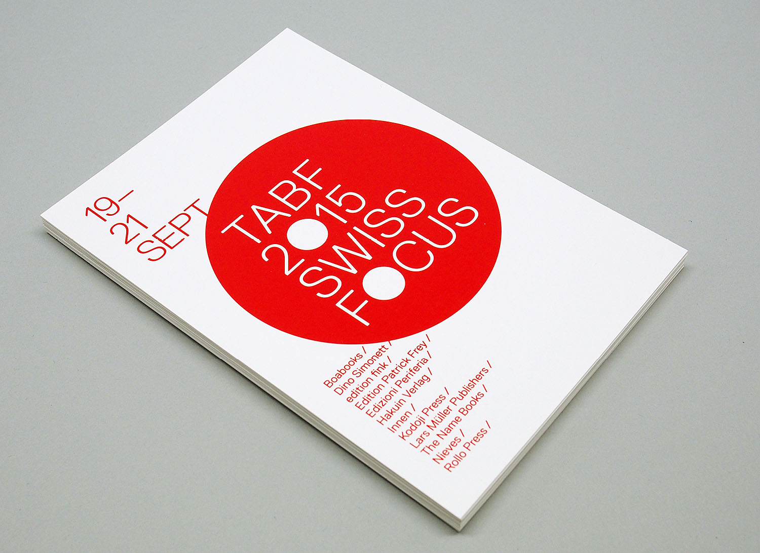
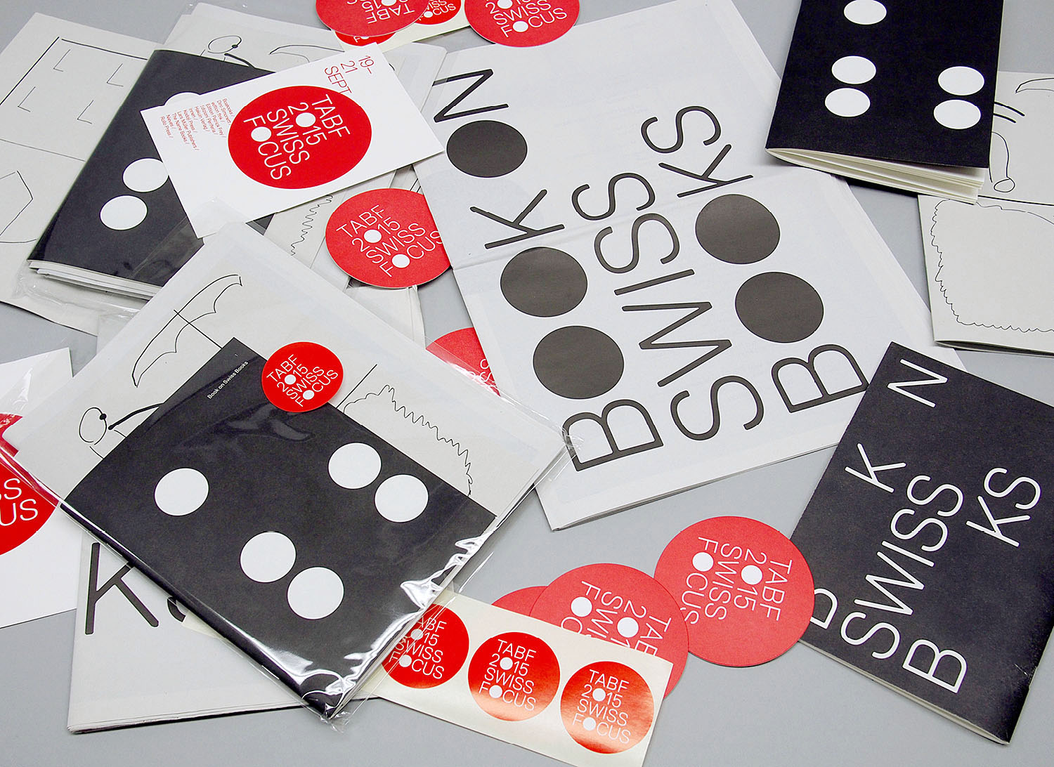
swiss focus branding // exhibition space design // implementation
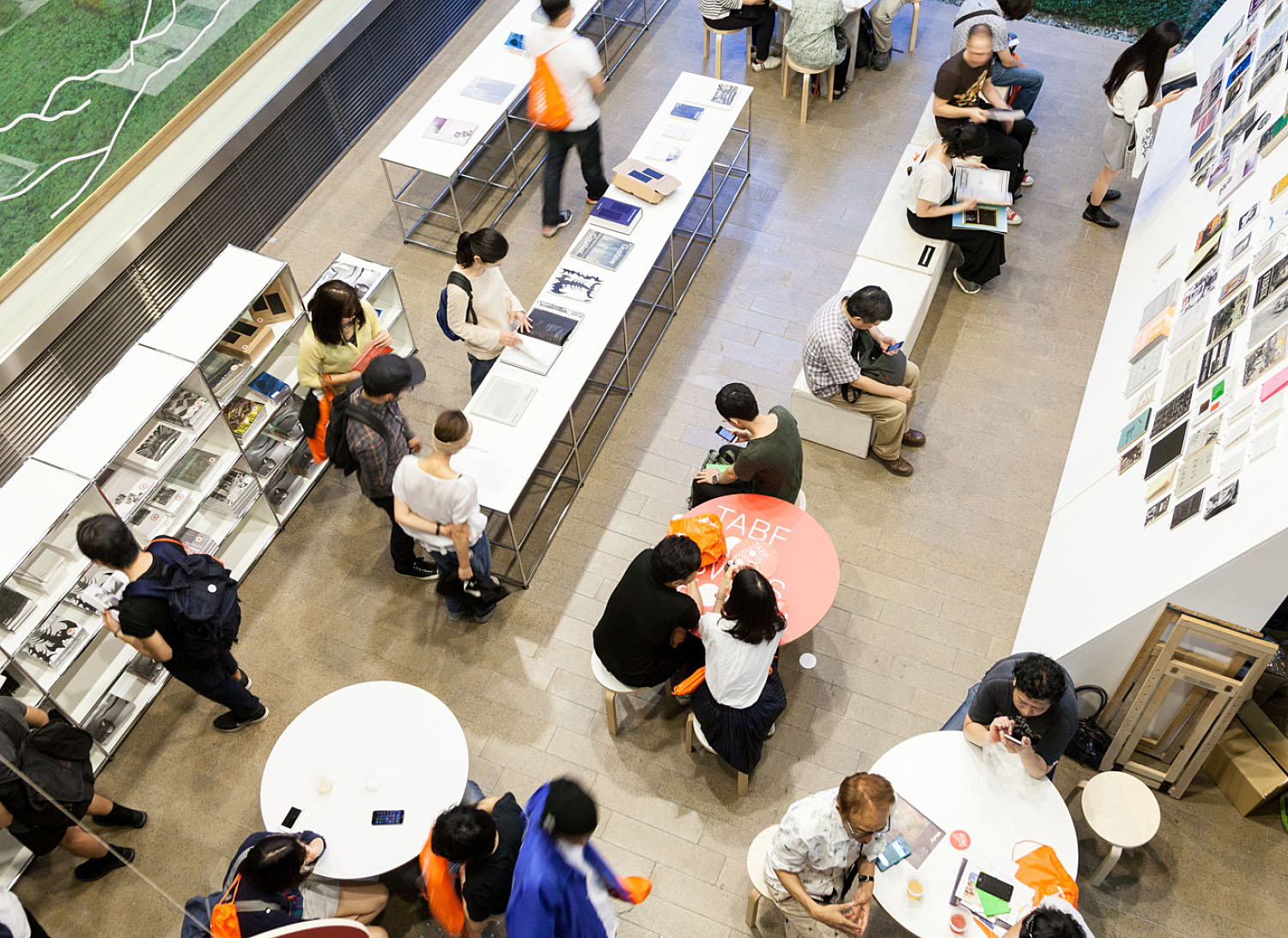
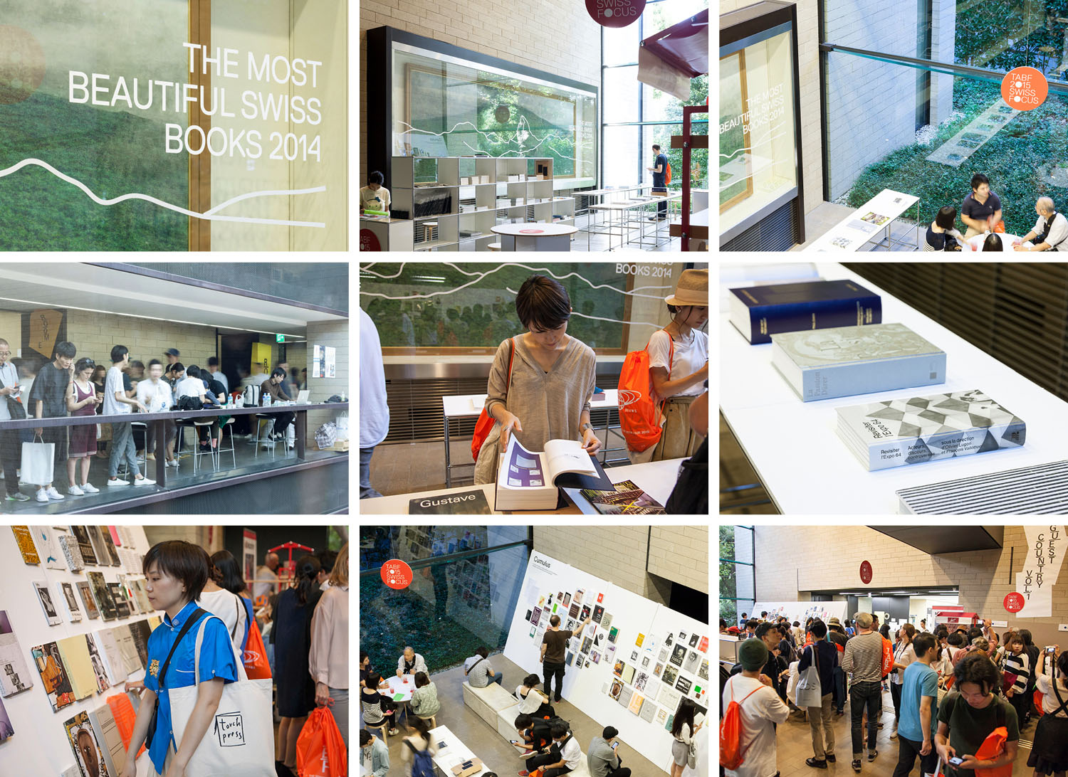
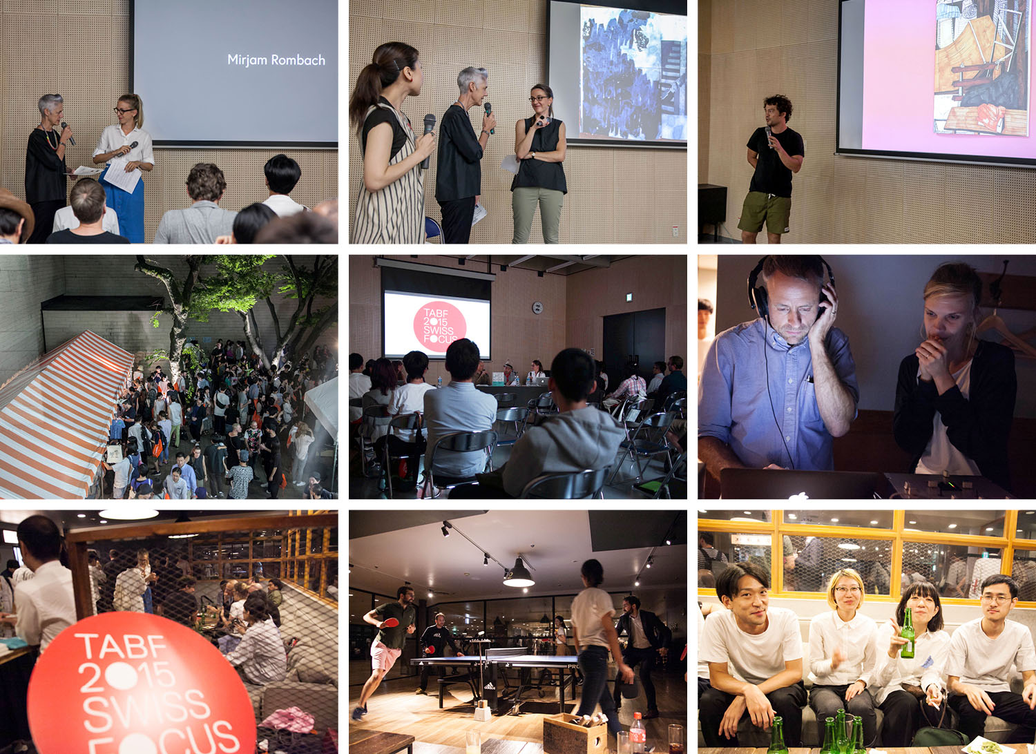
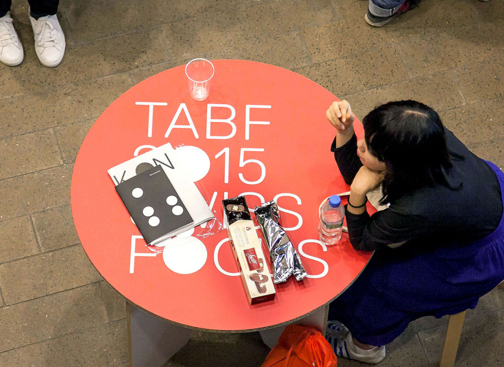
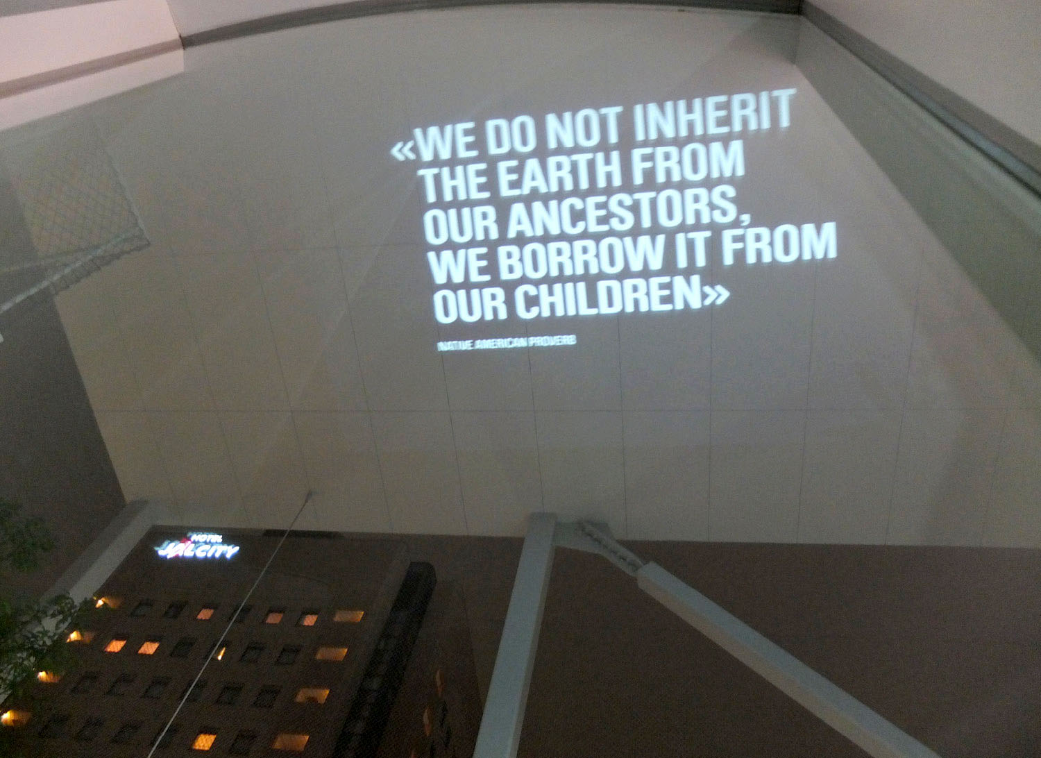
so+ba has co-organized and designed the swiss appearance at the «tokyo art book fair 2015». the project included two exhibitions, several presentations and talks including swiss publishers presenting at the pecha kucha night, and a party-event. one of the two exhibitions was «the most beautiful swiss books» the other one was a curated book exhibition by roland früh and philippe egger. over 15,000 guests have visited the «swiss focus» during the three days.
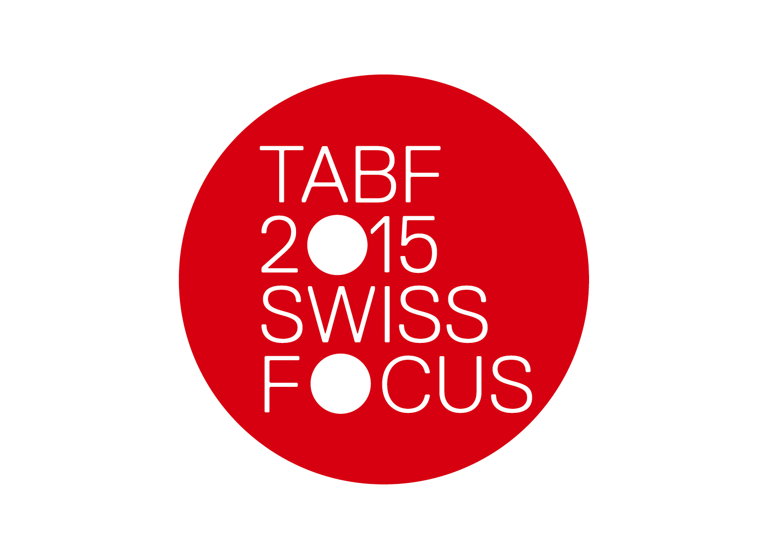
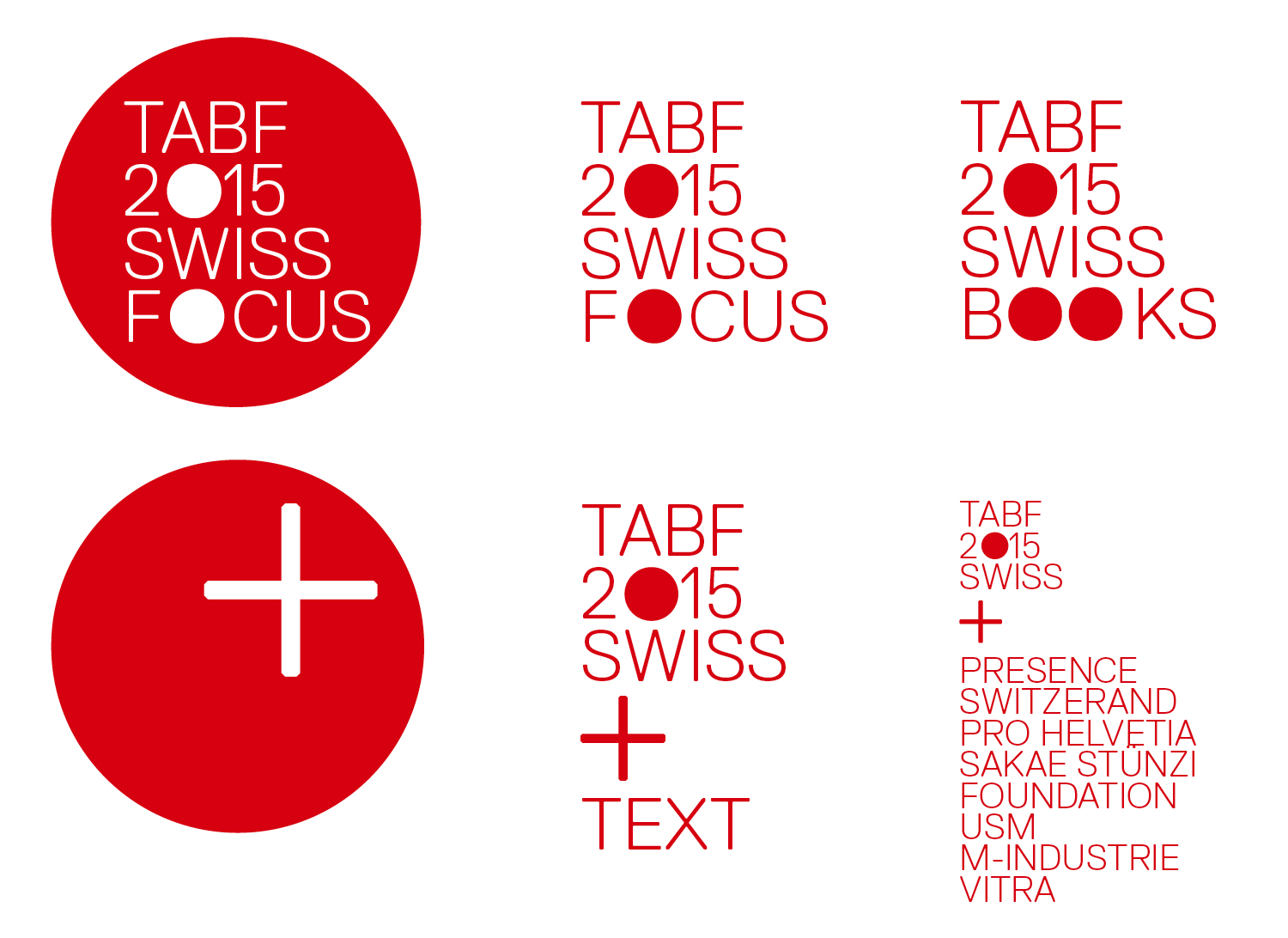
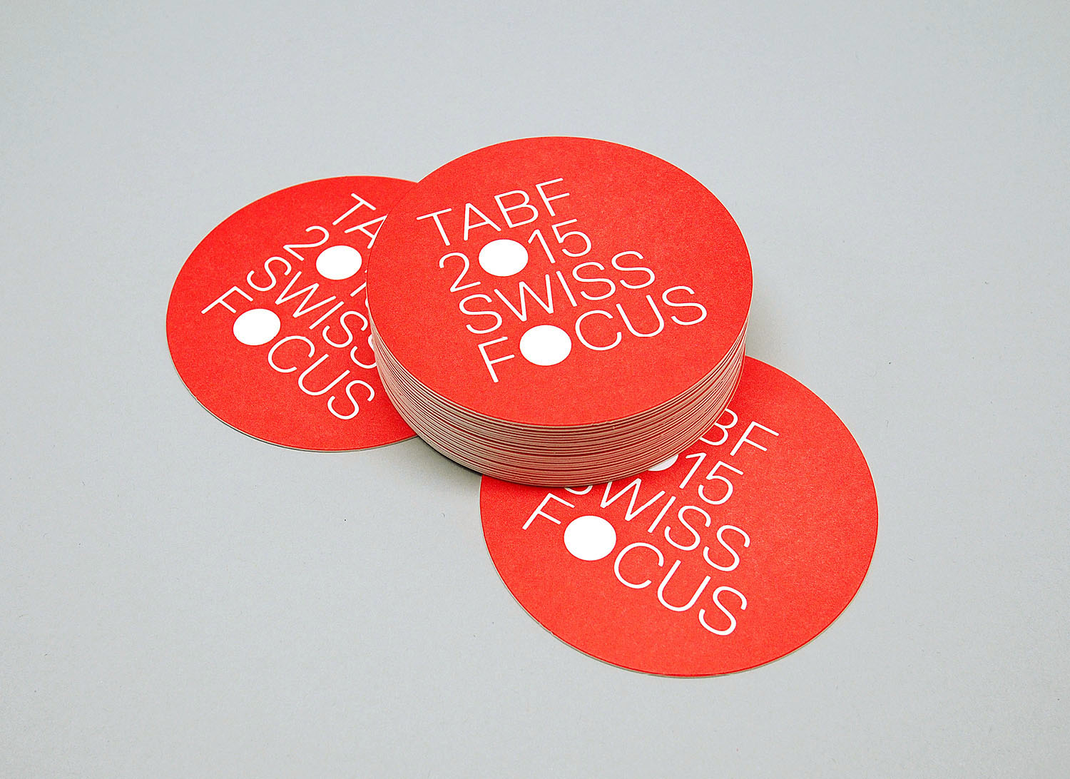
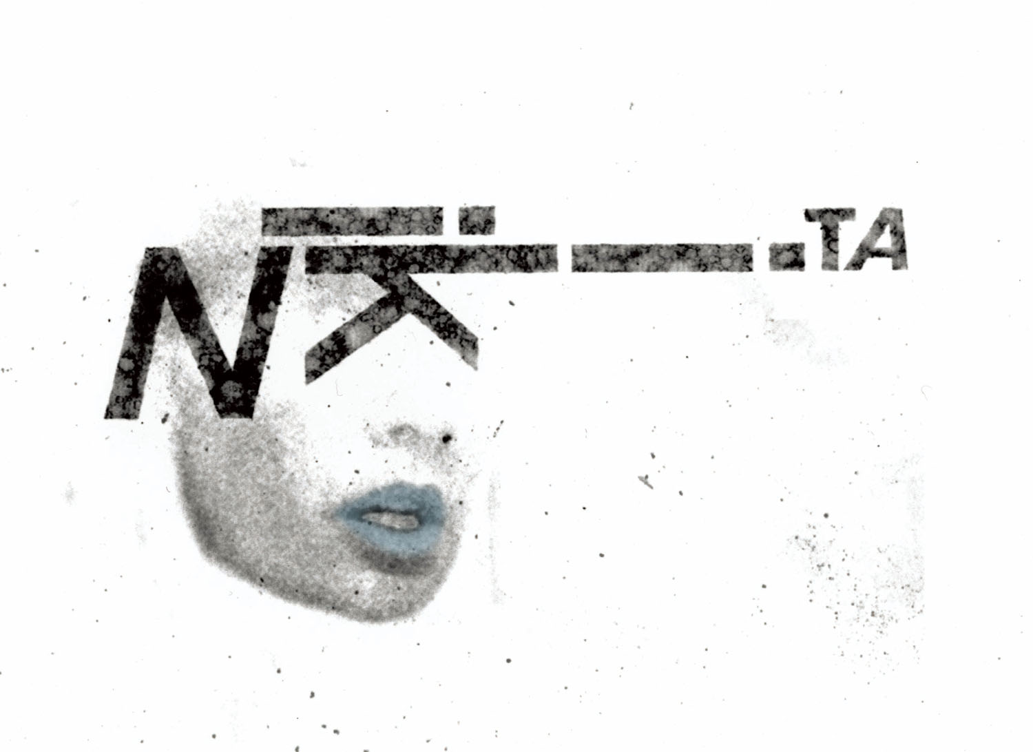
swiss focus logo and branding
the logo goes hand in hand with the branding. the circle of the logo symbolizes the «focus» and brings different topics into one on equal levels. the logo is created as a modular system, different parts can be added to the base using the plus mark to connect. the logo can be used in english or japanese. the plus mark also represents the swiss cross of the national flag.
tabf swiss focus
tokyo art book fair 2015
september 19–21
at kyoto university of art and design,
tohoku university of art and design gaien campus,
1-7-15 kita-aoyama, minato-ku, tokyo, japan
organzied by
yusuke nakajima / post
atsushi hamanaka / twelve books
futoshi miyagi / utrecht
resoponsible for the swiss focus:
swiss embassy in japan
so+ba
supported by: usm japan, vitra japan, m-industries japan, pro helvetia, presense switzerland